Insight

Common accessibility mistakes that hurt your app’s usability

Photo of Courtney Smith

Courtney Smith

digital marketing assistant

6 minutes

time to read

May 1, 2025

published

In the world of app development, accessibility should never be an afterthought. But too often, it is.

Ignoring accessibility doesn't just affect a small group of users, it creates barriers for millions of people. According to the World Health Organisation, over 1.3 billion people - that’s 16% of the global population - experience significant disability. And yet, many apps still fail to meet even the most basic accessibility standards.

For Global Accessibility Awareness Day, we’re shining a light on the common accessibility mistakes that hinder usability and, more importantly, how to fix them. These aren't just technical issues; they’re human ones. If your app isn’t accessible, it isn’t truly usable.

 

1. Low colour contrast

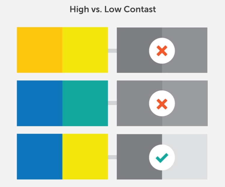
One of the most widespread issues in app design is poor contrast between text and background colours. It might look sleek and modern to your design team, but for users with low vision or colour blindness, it can render content unreadable.

According to WebAIM’s analysis of one million home pages, a staggering 83% had low contrast text.

Why this hurts usability:

  • Users with visual impairments, including colour blindness or cataracts, may not be able to distinguish text from the background.
  • Poor contrast becomes even more problematic in different lighting environments, think direct sunlight on a mobile screen.
A visual comparison titled 'High vs. Low Contrast' showing three pairs of color combinations. Each pair is shown in full color on the left and in grayscale on the right to demonstrate contrast. The top two pairs—orange with yellow, and blue with teal—have red X marks in grayscale, indicating poor contrast. The bottom pair—blue with yellow—has a green check mark in grayscale, indicating good contrast.

How to fix it:

  • Use tools like the WebAIM Contrast Checker to validate your colour combinations against WCAG 2.1 standards.
  • Aim for a contrast ratio of at least 4.5:1 for regular text and 3:1 for large text.
  • Don’t rely on personal judgment; automated and user testing is key to catching subtle failures.

Image source.


2. Using colour alone to convey meaning

Ever seen a form where an error is only marked in red? Or a calendar app that uses only colour-coded dots to distinguish events? That’s a problem.

An estimated 300 million people worldwide have some form of colour vision deficiency.

These are examples of colour dependent designs - interfaces that rely solely on colour to communicate key information.

Why this hurts usability:

  • If colour is your only method of conveying status, feedback, or information, users with colour blindness or low vision might completely miss critical content.
  • Important instructions, warnings, or changes may go unnoticed, leading to confusion or task failure.

How to fix it:

  • Pair colours with other accessible indicators - like clear, meaningful icons, patterns, or labels. For example, use both a red outline and an error message like “Password must be at least 8 characters.”
  • Use symbols such as checkmarks, crosses, or exclamation icons to add visual clarity.
  • Run your UI through a colour blindness simulator like Coblis to test for clarity.
 

3. Lack of screen reader support

Screen readers are essential tools for people who are blind or have low vision. But unless your app is coded with accessibility in mind, these tools can’t make sense of your interface.

Why this hurts usability:

  • Without accessible labels, buttons may be announced as “button” with no context.
  • Important visual information, like image content or field instructions, may be skipped entirely.
  • Complex or unstructured content becomes frustrating to navigate, leading to poor user retention.
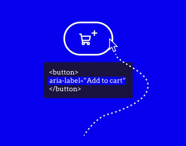
Illustration showing a 'Add to cart' icon button with a shopping cart symbol and a plus sign. A cursor points to the button, and a dashed line leads to a code snippet displaying: <button aria-label='Add to cart'></button>, highlighting accessible web development.

How to fix it:

  • Use semantic elements and ARIA labels to give screen readers the context they need.
  • Make sure every interactive element (buttons, form fields, links) has a clear, descriptive label.
  • Provide alt text for all non-decorative images and ensure dynamic content updates are announced appropriately.
  • Test regularly with screen readers like VoiceOver (iOS) and TalkBack (Android) to identify issues in real user environments.

Image source.


4. Inflexible, non-responsive layouts

A rigid layout doesn’t just break design responsiveness, it can create serious access issues for users who need to zoom, rotate, or interact with your app using assistive devices.

Why this hurts usability:

  • People using screen magnifiers or operating devices in landscape mode may not be able to access all parts of the UI.
  • Users with motor impairments often rely on adaptive input methods and need a flexible, touch-friendly design.
  • Fixed layouts can cut off content or make controls impossible to reach, especially on smaller devices.

How to fix it:

  • Build with responsive design principles, ensuring your app adapts to different screen sizes and orientations.
  • Use scalable units (like em or %) instead of fixed pixel sizes, and avoid absolute positioning when possible.
  • Design touch targets to be at least 48x48dp for ease of use, and ensure spacing prevents accidental taps.
  • Always test with both mouse and keyboard, as well as across a variety of devices.
 

5. Poorly designed forms

Forms are one of the most common interaction points in apps, and also one of the most common places where accessibility breaks down.

Why this hurts usability:

  • Without proper field labels, screen reader users have no way to understand what input is required.
  • Forms that don’t support keyboard navigation are impossible to complete for users who can’t use a touchscreen.
  • Vague error messages like “Invalid input” don’t tell users what they did wrong, or how to fix it.
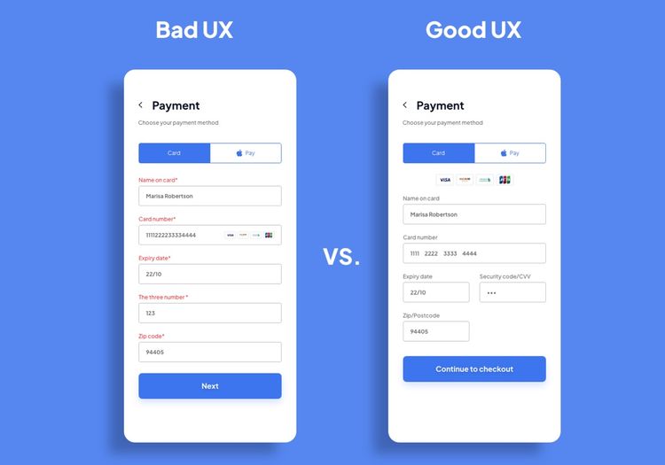
Side-by-side comparison of a payment form labeled 'Bad UX' versus 'Good UX.' The bad example shows cluttered input fields with unclear labels, a mix of validation errors, and no field grouping. The good example displays a clean, organized layout with spaced input fields, masked security code, grouped expiry and CVV fields, and a clearer call-to-action button labeled 'Continue to checkout.'

How to fix it:

  • Ensure every field has a clear, associated label - visually and in the code (using label and for attributes).
  • Enable keyboard navigation for all form elements, and maintain logical tab order.
  • Use accessible error handling: highlight the field in error and provide helpful, plain-language guidance that explains what went wrong and how to fix it - for example, “Please enter a valid email address.”
  • Where possible, use auto-fill and input assistance to reduce the burden on users with cognitive or motor impairments.

Image source.


Accessibility isn’t a feature - it’s a foundation

At The Distance, we don’t treat accessibility as something extra to be bolted on at the end. It’s something we consider throughout every stage of a project - not because it’s trendy or required, but because it’s the right thing to do.

We work with clients across a wide range of sectors, and regardless of the industry or user base, our aim is always the same: to make sure the digital experiences we create can be accessed and enjoyed by as many people as possible. That means thinking about accessibility from the first wireframe to final testing, and baking it into our design and development processes by default.

Because ultimately, it’s not about one case study or one success story. It’s about a consistent, thoughtful approach that treats accessibility as a baseline, not a bonus.


The bigger picture

Creating an accessible app isn’t about ticking boxes. It’s about recognising that every user matters and that great design should work for everyone, not just the average user.

The good news is that most accessibility issues are fixable. They’re the result of decisions made without inclusion in mind, and once you know better, you can build better.


Let’s build better together

Accessibility is an ongoing process, not a one-time project. Whether you're building from scratch or retrofitting an existing product, prioritising inclusive design is not just ethical, it’s essential.

On Global Accessibility Awareness Day, let’s commit to building digital experiences that truly welcome everyone.

Want to make your app more accessible and more usable for everyone?

We’re always happy to chat about how accessibility fits into modern app development. Whether you're reviewing an existing product or planning something new, we can help you build with everyone in mind.

 
contact us

Apply theses insights

Contact us to discuss how we can apply theses insights to your project