Insight

Designing accessible apps: A comprehensive guide

Photo of Emily Martin

Emily Martin

ux/ui designer

May 18, 2023

published

Most of us use apps these days, whether we’re managing our money, communicating with healthcare providers, shopping or playing games. This includes a high proportion of people with specific accessibility requirements, including many of the estimated 1.6 billion disabled people on the planet today.

There’s evidence to suggest that for many people with accessibility requirements, some apps are not currently inclusive. In the UK, a 2020 survey by the Research Institute for Disabled Consumers (RiDC) showed that 90% of disabled people have downloaded an app, but also that 26% had experienced difficulties with accessing or managing apps.

Here at The Distance, we’ve been creating accessible apps for many years, and we’re always learning about new ways to make apps more inclusive. In this primer, we’ll share some of our core inclusive design principles and techniques for improving app accessibility.

Why should apps be designed for accessibility?

We expect you already have an opinion on why accessible and inclusive app design matters.

However, you might need to convince other stakeholders on your app project (e.g. a client or key decision maker on your team) of why it’s important to design your app to be accessible and inclusive.

There are lots of good arguments to help you make your case, including:

  • Doing the right thing. Wherever possible, everyone should have a fair opportunity to use an app.
  • Maximising app reach and engagement. 1 in 4 people in the UK are disabled, and many others have digital accessibility requirements. There’s a clear business case for serving everyone as well as possible through your app.
  • Meeting government requirements. Per the UK government’s Equality Act, service providers are required to take reasonable steps to avoid disadvantaging disabled users.
  • Reputation. Brands are increasingly expected to use accessibility best practices – and to use them properly.

How to estimate your app users' accessibility requirements

Most app developers and app owners will be aware that some of their users have accessibility needs. However, it can be difficult to gauge the prevalence of these requirements across an app’s user base.

We recommend using this government-backed online tool to estimate the number of your app users who will have specific accessibility requirements: https://how-many.herokuapp.com/

You simply enter the number of users your app (or website) has, and then the site uses government data to predict how many of your users:

  • Wear glasses or contact lenses
  • Have any disability
  • Are deaf or hard-of-hearing
  • Have literacy below Level 1
  • Are dyslexic
  • Have a colour vision deficiency
  • Are blind or partially sighted
  • Are autistic
  • Are British Sign Language (BSL) users

All of these accessibility requirement types should be factored in when designing an app.

Further, it’s important to note that different requirements will apply to certain users in different ways. The Crown Commercial Service specifies three categories of disability to consider when designing for accessibility:

  • Permanent – e.g. one arm, blind, deaf, non-verbal
  • Temporary – e.g. arm injury, cataract, ear infection, laryngitis
  • Situational – e.g. new parent, distracted driver, bartender in a noisy venue, heavy accent

These wide-ranging categories drive home the point that app accessibility isn’t just about catering for a few specific requirements – it’s about designing apps that work for as many people as possible.


How to make your app accessible

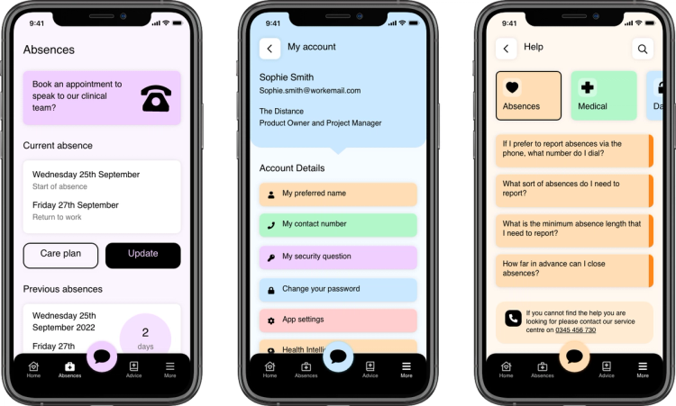
Inclusivity and accessibility go hand-in-hand with many requirements of all-round user experience (UX), from flexibility of access to content (e.g. through providing content in both audio and text formats), to ease of navigation.

In this section, we’ll take you through some of our practices for making an app more accessible, while elevating the overall UX for all users.

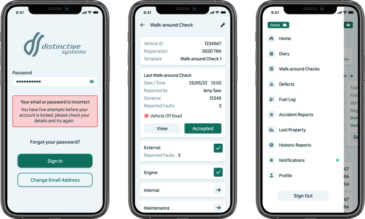
how to make your app accessible - mobile phone examples

Colour contrast

The use of strong colour contrast can help people who have relatively low vision or colour vision impairment to see app content and tell colours apart.

Follow these steps to ensure your app has accessible colour contrast:

  1. Review colour contrast using this free online tool: https://color.review/
  2. Every part of the app user interface (UI) should receive a standard of AA or AAA. If not, tweak the colour contrast wherever necessary.
  3. Check designs in greyscale to ensure information is not colour dependent, using the Sim Daltonism colour blindness simul

You can further improve your app’s visual accessibility by using visual signifiers (other than colours) in the UI, such as:

  • Symbols as well as a colour – e.g. an error message could show an exclamation mark or X mark, as well as being red.
  • Different button states – e.g. if two buttons are placed together, make the first filled and the second outlined (secondary button state).

Screen reader compatibility

A screen reader is a software which people with severe visual impairments can use to see and/or hear the content shown in a digital UI.

Screen readers are highly relevant to mobile use cases. Research by WebAIM has shown that 90% of people who use a screen reader are using the technology with mobile devices.

To improve your app’s compatibility with screen readers, think carefully about the structure of the on-screen content, and about the text used in your links, error messages and buttons. In particular:

how to make your app accessible - mobile phone examples
  • Make link text clear and specific – e.g. instead of ‘Read more’, use ‘Read more about [Subject]’.
  • Make error text informative and exact – Error messages like ‘Oops… something went wrong’ are unhelpful to people using screen readers. Instead, use specific messages such as ‘Incorrect password. Please try again.’
  • Signpost solutions to errors – Append error messages with instructions on what to do next, e.g. ‘Please wait a few minutes and try again’.
  • Add alternative text to visual elements – Hidden text labels can be added to icons/images to describe what they are and whether they can be interacted with, e.g. ‘Interactive graph of your step count for today’.

Improving the accessibility of interactive features

Interactive features often deliver some of the core value of an app, so it’s especially important to make interactive components accessible.

Here are some ways to do this:

  • Signpost interactive components – Clearly indicate which components of your app UI are interactive (e.g. clickable elements like buttons and information cards), through the use of design techniques such as drop shadows and outlines.
  • Design consistently throughout your UI – If users can learn the ‘rules’ of how the UI works, it will be much easier for them to navigate and identify interactive components. Some of our tried-and-tested tactics to improve consistency include using components in Adobe XD to easily reuse elements; reusing existing elements in app updates/redesigns; and checking for consistency during app testing.
  • Design your buttons with ample touch area – The recommended minimum touch target of an interactable element is 44px – an area which allows the element to be touched by the average adult finger pad. In some cases, you could also consider making the tappable area bigger by including an invisible hit area around the button or icon itself.

Accessibility-first app design and testing

We hope that this primer has given you some useful ways to help all of your users get more value and enjoyment out of your app. The practices we’ve covered are a good start, but there’s much more that you can do to improve app accessibility and inclusivity.

Some additional practices to explore include:

  • Make content available in both audio-visual and text formats
  • Use speech input features
  • Provide users with a way to talk to your team (e.g. an integrated chat feature)
  • Listen to feedback from users with accessibility needs

Above all, we suggest you start foregrounding accessibility in your app design and testing processes. Think carefully about how your decisions will impact people with different accessibility requirements, and consider how each new component or design choice could be made more accessible.

A more accessible app is a better app – so start thinking accessibility-first.

The Distance's approach to mobile app accessibility

Here at The Distance, we start thinking about accessibility at the very outset of the app creation process.

Before we design the app, we send the client a design questionnaire, which asks whether there are any particular accessibility features that they want to include. The ideas raised are then discussed and considered for implementation.

Further, if we have any accessibility ideas of our own to bring to the project, we suggest these to the client, giving consideration to what we’ve learnt about the client’s users/audience through workshopping. Check out how we designed an app to target users with Down syndrome in the video below:

On top of this, we implement the accessibility best practices we’ve outlined in this guide as standard – from visually accessible colour contrasts to accessible button states.

Are you looking to make your app more accessible? Do you want to learn how we can audit your existing design and increase its accessibility and make it inclusive for all?


contact us

Apply theses insights

Contact us to discuss how we can apply theses insights to your project