Somewhat recently, Google made a change to the way their sign-in form works. Many likely won’t notice, but those with a sharp eye among you will have spotted that the eye icon used to show/hide your password has changed. It was once a little eye with a slash through it by default, but now it’s just a regular eye. Of course, some of you may feel that this tiny change isn’t worth talking about, but it’s an earmark of a problem for product designers, especially those in agencies serving clients. Bear with me while I try to explain.
A quick history
The password eye originally came to be as a rather smart way to fix various problems with UX among most websites. First of all, people had the issue of others peering across them while they type in their passwords, which of course nobody wants. As a result, sites started hashing them in what we now call secure text fields. This meant nobody could se● ●●●● ●●● ●●●● ●●●●●●.
Next, people had the problem of setting passwords with typos, and couldn’t log back into their accounts. To solve this, sites started to add two password fields to validate each other and to make sure there weren’t any typos or misspellings. Now, we have two forms, in which users take longer to register, increasing frustration and in some cases reducing conversion rates. Two password forms are also more difficult for some autofillers to get around, reducing speed again.
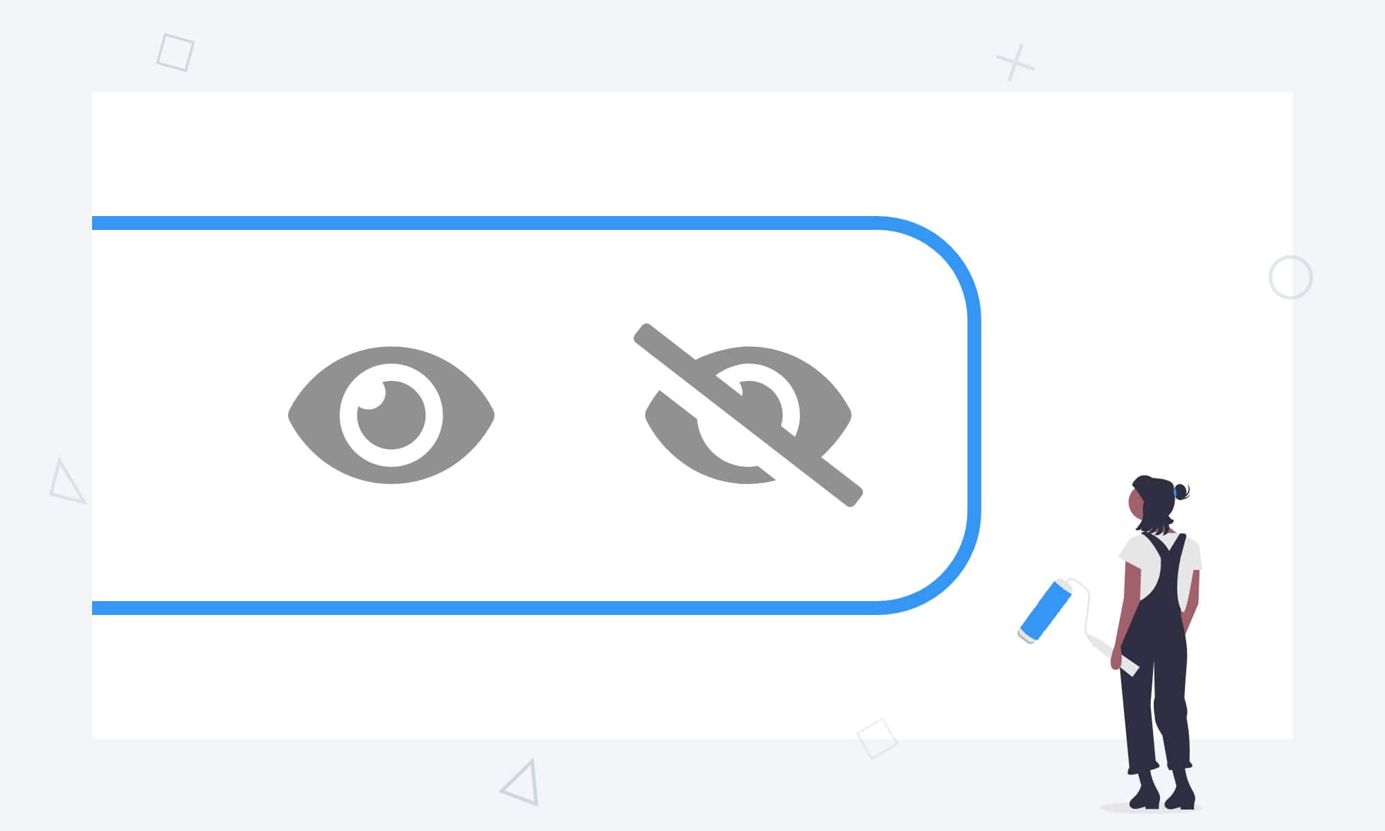
The clear solution here is to toggle between showing a password and not. This gives users the right combination of privacy in public environments, speed of registry (for the vast majority of users), and the ability to check for things like typos if this is a problem. Basic implementations first had a separate checkbox. With the current variety of checkboxes for functions such as ‘stay logged in’ or ‘sign up to mailing list’, adding more of these was once again detrimental to user experience.
Rise of the password eye
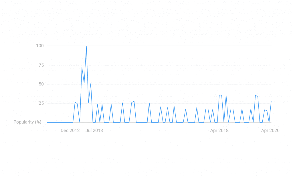
Henceforth, the password eye was brought into use. People first began to look for icons relating to this around December 2012 according to Google trends, with the use of the icon suddenly becoming all the rage coming into mid-2013. Since then it more or less became the standard on both web and app solutions. It’s what Material Design still advocates too (along with just about every other design system), so most devs and designers added it to their arsenal. Now comes the real problem: Which way round to put the eye/eye-slash icons.
The obvious solution according to most ux principles is to make the icon display what will happen if you click/tap it (the ‘go-to’ state). This would imply that while the password is dotted across, the eye is open. The only issue with that is that the icon is far less recognisable, since open eyes are used to represent view modes for all sorts of things. This has led to various sites swapping the icons over, as much as it doesn’t quite make sense. This, until recently, included Google. Now, with everybody starting to use password managers and keychains, lots of companies have decided their show/hide options are no longer useful for users and have gotten rid of them entirely. Others have circumvented this icon confusion by using text instead.
How major brands handle this
I appreciate that this sounds like a conflicted list of issues, but it’s produced almost an identically conflicted set of results. If I list how some of the top brands handle this minor problem on their apps, you’ll notice that there is absolutely no standard for this practice at all. Best of all, most of them keep changing too:
| Adobe | Sometimes nothing, sometimes an eye with the go-to state shown. Depends on the product. | |
| Amazon | Checkbox | |
| Angular | Shows you the current state eye icon. | |
| Apple | Nothing | |
| ASOS | Text button | |
| Deliveroo | Nothing on login, text button on signup | |
| Disney | Text button | |
| Facebook/Instagram | Used to have a text button, now nothing | |
| Recently changed from current state to go-to state eye icon | ||
| IBM | Shows you the current state eye icon | |
| Microsoft | Have used the icon in and out with various products, now nothing | |
| Mozilla | Text button | |
| Netflix | Text button | |
| Always an open eye icon | ||
| Samsung | Shows you the current state eye icon | |
| Used to show go-to state eye icon, now nothing | ||
| Twitch | Shows you the go-to state eye icon | |
| Uber | Nothing | |
| WordPress | Sometimes a go-to state eye, sometimes nothing depending on version |
The new problem
The problem this presents for designers and agencies is one of consistency. Many development agencies and smaller tech companies follow Google’s material design guidelines for ensuring a great user experience in projects. This is because they’re backed by millions of dollars invested in user research; and 99% of the time, they prove invaluable in creating digital products.
During the development process, every minor detail of apps have to be scrutinised by BAs, product owners, designers, developers, and the like. When somebody asks the reason that your password show/hide icons are in a particular direction (which believe me does happen), there spells a lengthy conversation, to eventually realise that there is no answer to the original question. This being because the guidelines we’re so used to following change, and in this case they don’t follow what seems to be the trend of removing this little piece of functionality entirely. Everyone I know has a personal opinion on this tiny problem, and nobody knows what’s right.
If you still aren’t sure which icon to use or have other design decisions to make, we recommend contacting our Head of Partner Success to discuss and explore the challenges further, get in touch and speak to a member of our talented team today.