
Animation offers a medium of storytelling and visual entertainment which can bring pleasure and information to people of all ages everywhere in the world. – Walt Disney
The majority of mobile apps contain animations; the extent of which varies greatly from one app to the next but the premise remains – animation has become a cornerstone in app design. When a view in an app changes, we expect an animated transition. When a view takes a while to load, we expect an animated spinner. Without these, the experience for the user can be jarring, cause confusion and even lead to unexpected behaviour. A spinner is a universal message to the user that the view is loading, and to be patient.
Obscuration through animation
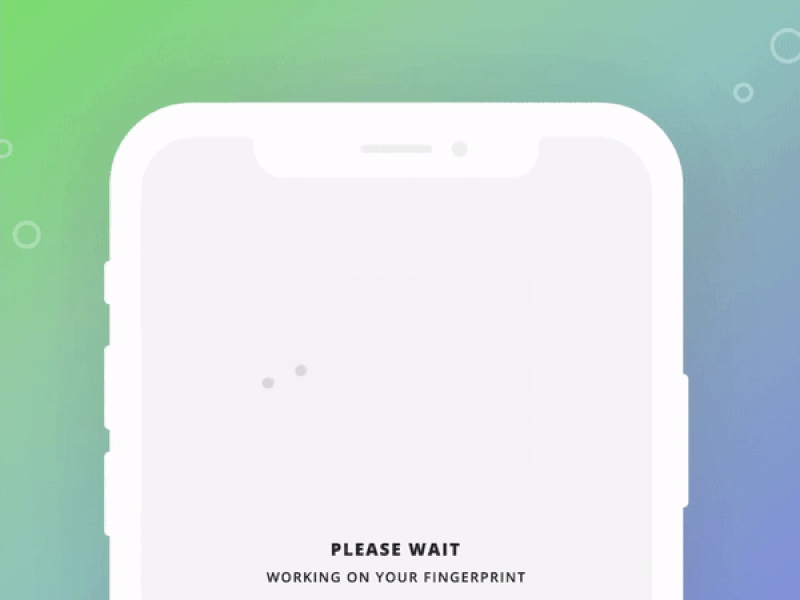
Good use of animation in mobile design is often used to obscure a background process. Something’s happening – a data request, a data migration – and the user is being distracted to forget, at least temporarily, that they’re waiting. Distraction as a means to reduce frustration isn’t a new concept, in fact it’s all around us. When video games load, often a mini-game will be presented to the user. When you order a Domino’s pizza, you’ll likely find an interactive pizza tracker keeping you up-to-date with your order. And, in an airport, the long walk from the terminal to baggage claim – seemingly longer than the flight itself – is a temporary distraction from having to ‘wait’. The result of all of these are the same, distractions reduce the perceived wait time.
Storytelling
Ease of information digestibility is important – too much information and the user will be overwhelmed, too little and the user will be confused. Both will likely lead to a dissatisfied user and with it, a decline in interest toward the app. Tell a story; if a picture can say a thousand words, an animation can tell infinitely more. A common means to present the utility of an app to a new user is through the use of onboarding screens. These screens offer the chance to explain to the user the possibilities and expectations that they can have of the app. And, in the highly competitive world of mobile apps, the story told to the user must be appealing otherwise they’ll likely move elsewhere.
KISS – no, not the band
Outside of the scope of animations covered above lies the decorative animations. These, ultimately, serve no purpose, but that doesn’t mean that they’re not useful. The trick is, select usage carefully – ask if the animation is needed before adding it. Like a cake, decorations – for the most part – aren’t going to change the taste of what lies underneath. They’re a nice addition, aesthetically pleasing and they serve as the finishing touch. Decorative animations in mobile apps should be treated in the same manner. Select carefully, and if it works, it works. The idea here is: less is more.
With the breadth of tools available to mobile developers, it’s easy to get carried away with animating everything. One wouldn’t smother a cake in decorations, and one shouldn’t smother their app with decorative animations. The average user doesn’t want to wait longer than needed and even a fancy animation soon becomes dull with enough viewing. Keep it simple, stupid.
Conclusion
So, to wrap up:
- Transitions and indicators: use animations without question.
- Decorative animations: use sparingly, if at all.
Article by Chris Fulford, iOS Developer at The Distance.