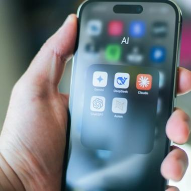
You’ve devised an idea for an app that will do valuable things for its users. Now you need a plan to convert those users into paying customers. This guide will take you through how to add in-app payments or subscriptions for Android and iOS, so that you can have a viable revenue model, right from launch day.
Monetise your app: Essential strategies for success

Emily Martin
ux/ui designer
13 minutes
time to read
April 21, 2023
published
Planning your in-app purchases or subscriptions
There are lots of choices to make when planning an in-app purchase, including the purchase type, pricing strategy and product details. We don’t mean to worry you, but the decisions you make at this stage will go a long way towards determining which users will actually make a purchase, how people perceive your brand, and how much money your app makes.
Whether it’s a one-time purchase, a subscription model, or microtransactions, understanding the best in-app purchase strategy for your app will set you up for long-term success.
Purchase type
It’s likely that your in-app purchases will fall into one of these four categories:
- Consumable. A single-use asset that the user can use to a limited extent, until the consumable is “used up”. Examples of consumables include gaming app coins or tokens, premium app features and temporary ad removal.
- Non-consumable. A repeat-use asset that becomes permanently associated with the app user’s account, and which belongs to the user for the entire duration of the app-user relationship. Examples include premium app features, paywalled content, and in-game items (such as character skins).
- Auto-renewing subscription. An ongoing subscription to app content and/or services, which is automatically renewed at the end of each billing cycle, until the user cancels the subscription. Many best-of-breed apps provide auto-renewing subscription services, including Spotify, Netflix and Duolingo.
- Non-renewing subscription. A subscription which must be renewed manually by the user ahead of each new billing cycle. This option is often offered as an alternative to an auto-renewing subscription.
Not all purchases are created equal. You’ll need to decide what fits your app and audience best. Are users unlocking premium features with a one-time purchase, or are you encouraging long-term engagement through a subscription model? Offering variety gives users flexibility—and that’s key to keeping them invested.
Some in-app purchase options come with strings attached. For example, Apple has tightly enforced rules on how subscriptions should be sold to iOS users. An imperfect implementation of subscriptions could lead to your app build being rejected from Apple’s App Store.
It’s also worth considering whether in-app purchases are actually the most suitable way to monetise your app. While a dominant share of global app revenue comes from in-app purchases, some apps take the alternative route of getting the user to pay upfront before download. Over 90% of apps in Google Play and the Apple App Store are free to download – but a minority of apps (such as Driving Theory Test 4 in 1 Kit (Android) and PRIME Tracker (iOS)) do find commercial success through paid downloads.

Free trials and discounts
Convincing a user to make their first purchase is often challenging. We all love to use shiny, new apps – but we’re far less enthusiastic about paying for them.
One tried-and-tested tactic to increase conversions from app users into customers is to offer introductory discounts, or free trial periods for subscriptions. This approach may earn you less revenue per sale than selling every item ‘full-price’, but it could also greatly increase the number of users who try your in-app products or subscriptions.
Letting users try before they buy can be a game-changer to hook users in, this way you can show them why your premium features are worth sticking around for. It's a tried-and-true way to boost conversions.
Research by RevenueCat suggests that app owners can expect a conversion rate from free to paying subscribers of around 30-45%. It’s also worth bearing in mind that users who only ever use free features of your app (or a free trial) may add significant value to your business through reviews and referrals.
Safeguards for children and vulnerable adults
In-app payments and subscriptions are usually a fair and effective way for app owners to earn remuneration. However, there are a few potential ethical pitfalls to consider.
In particular, it’s important for app owners to protect very young users from the risk of making excessive in-app purchases. We’ve all heard horror stories about kids spending their parents’ money in-app. For instance, a child in the United States spent $16,000 on in-app purchases for the iPad version of a game called ‘Sonic Forces’. If you’ve ever had the displeasure of playing that game, you’ll appreciate the scale of the travesty that took place here.
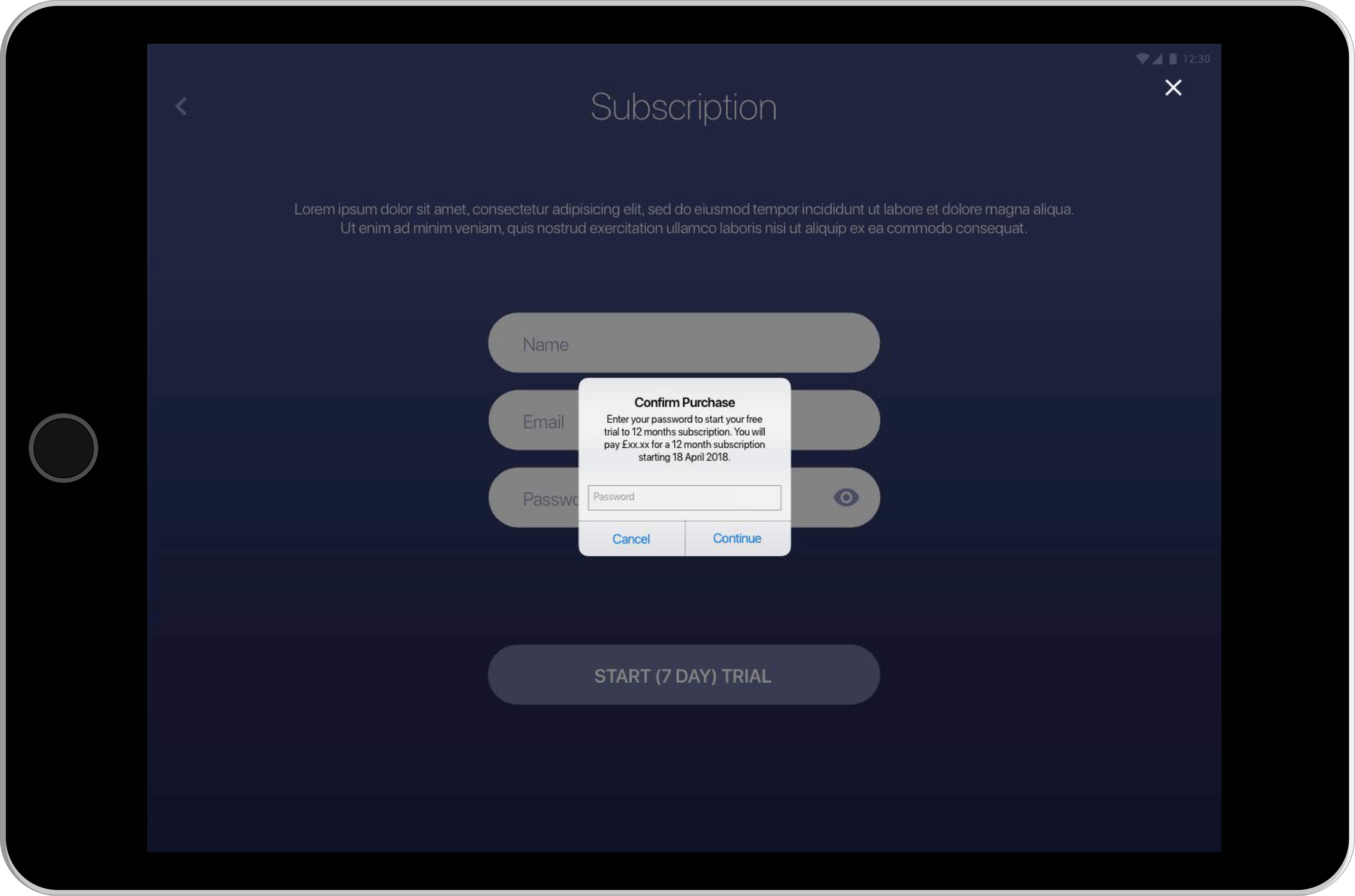
On a serious note, we’d like to think that most brands would wish to avoid situations where young or vulnerable app users are making purchases they (or their parents) can’t afford. Effective tactics to discourage excessive purchases include facilitating family controls or permissions for your app, and alerting users to unusual patterns of purchases made via their user account.
Designing in-app payments
In-app products and subscriptions need to be incorporated effectively into your app’s user interface (UI). The new product feature will affect the app’s user experience (UX) – and other aspects of the UX will affect the success of the payment feature too.
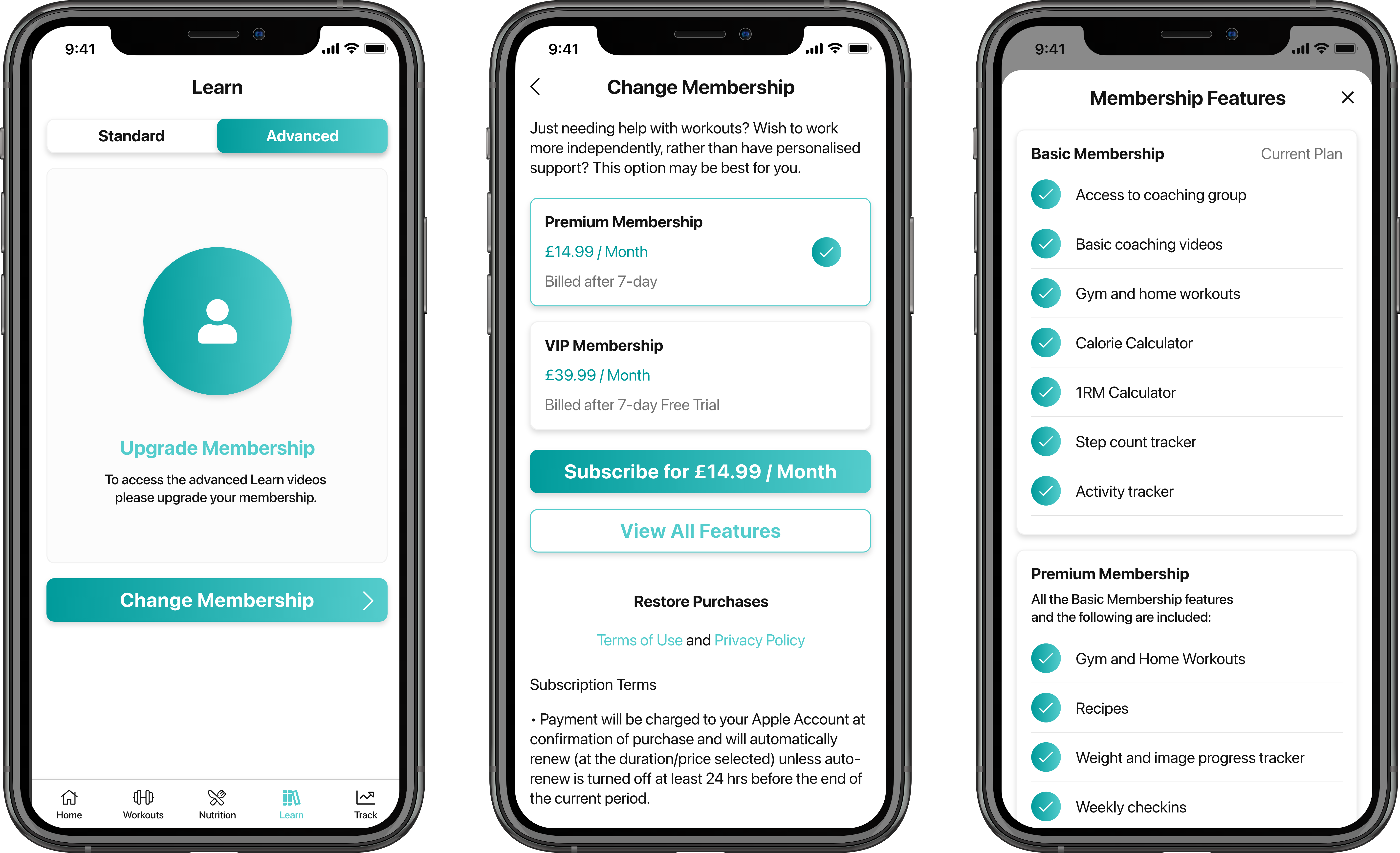
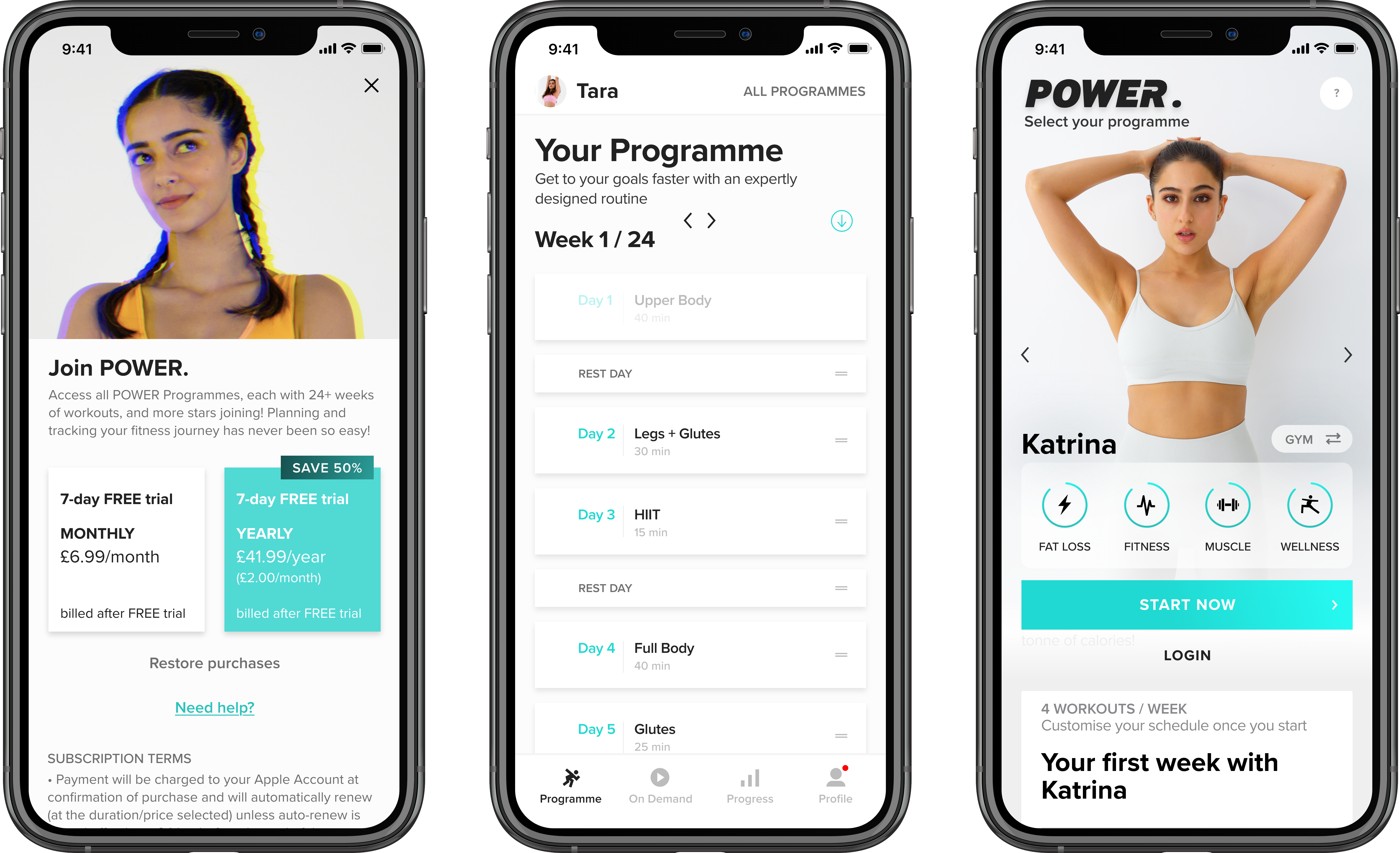
When a user goes through the journey of an in-app purchase, the last screen they’ll see before completing the transaction is a purchase or subscription screen. Typically, this will feature the name, image (where applicable) and price of the item/subscription, plus a ‘Buy now’ or ‘Subscribe’ button.
Here are some examples of effective purchase screens:
The effectiveness of an in-app purchase screen can greatly affect the percentage of interested users who actually convert into paying customers. When you reach the point where your in-app products or subscriptions are ready for testing with a limited audience, we’d suggest setting up some multivariate tests to find out which purchase screen design options deliver the best conversion rates.
You should also be thinking about what happens after a user makes a purchase. How will this affect the notifications that your app sends to the user’s device? Will you send the user emails to teach them about different ways to get the best out of their purchase? And which visual assets will you use to highlight the user’s paid/premium status within the UI? In a nutshell, you need to design a ‘paid user’ experience for the customers who buy your products or subscriptions, and this will require unique creative assets including visual components and UX copy.
The app stores as middlemen
In-app payments are an important source of reward for the value your app provides to its customers. Equally, the payments are highly important to Google Play and Apple’s App Store – both as a source of revenue, and as a customer experience factor.
With each in-app payment (or paid download), the app store acts as the ‘middle man’ between the user and the app owner. Whether it’s an in-app purchase or a subscription purchase, each in-app transaction is handled by Apple or Google, for iOS apps or Android apps respectively.
Before you receive the revenue from an in-app purchase, the app store owner takes a commission, which may vary based on the payment type, the duration of a subscription and the scale of your business. You should factor in these rates when you plan the pricing of a digital product or subscription.
Apple charges a commission of 30% for most app sales and in-app purchases. However, in the case of subscriptions purchased in-app, this reduces to 15% after the first year of the subscription. And if your business has an income of less than $1 million per year, you may qualify for a 15% commission rate across all purchase types, under Apple’s Small Business Program.
As for Android apps sold via Google Play, Google takes 15% commission on the first $1 million revenue earned by the app owner each year, rising to 30% after that threshold has been reached. In the case of automatically renewing subscriptions, Google charges a flat commission of 15% throughout the duration of the user’s subscription – a major incentive for app owners providing subscription-based app services.
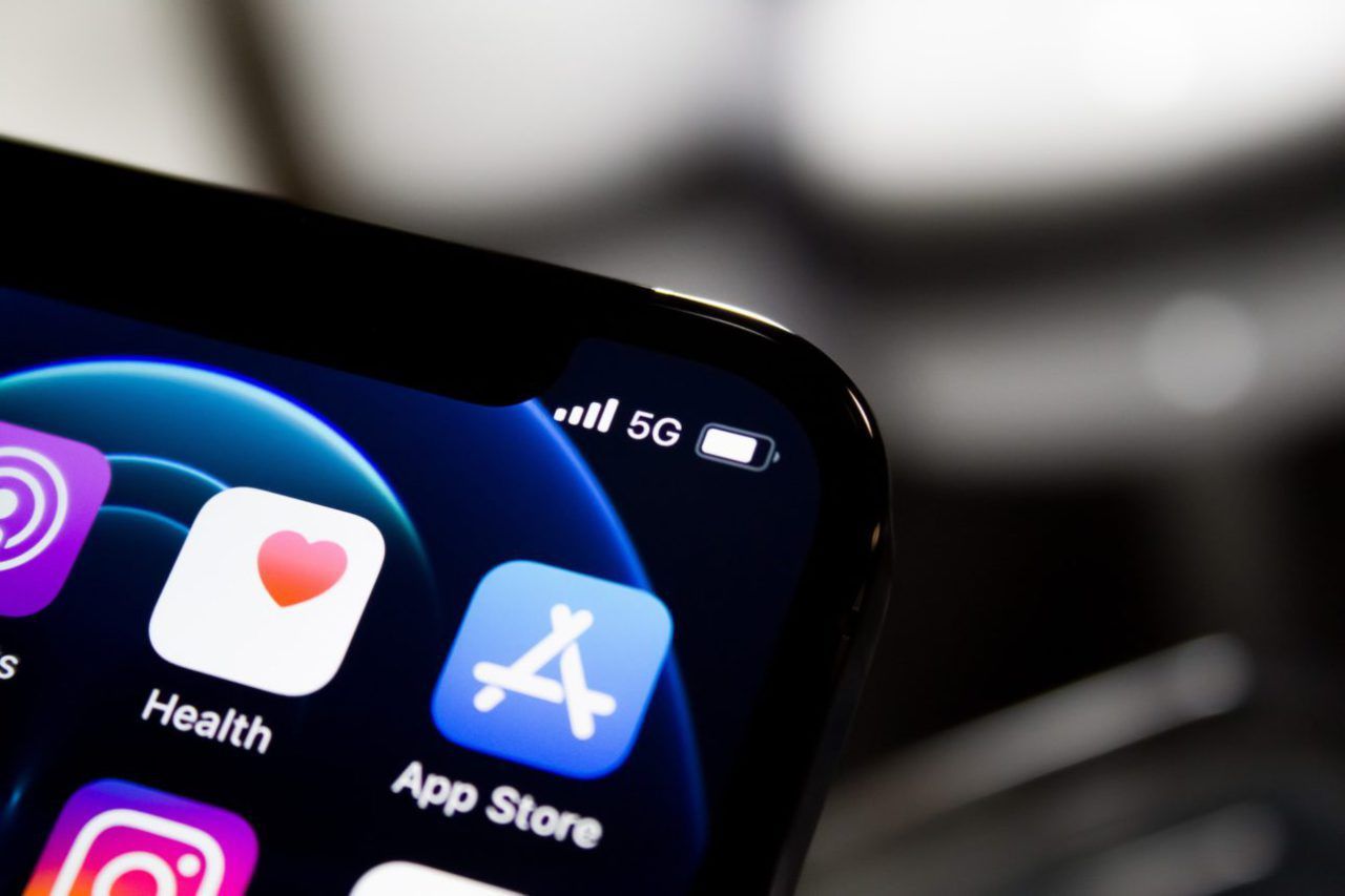
Even the most powerful app owners can meet resistance when their approach to in-app payments goes against the interests of one of the app stores. From 2020-23, Epic Games, the developer-publisher behind Fortnite, was in dispute with Apple over Epic’s practice of selling the in-game currency ‘V-bucks’ externally to the iOS app, which denied Apple its expected 30% cut of sales. Fortnite was temporarily pulled for the app store, before Apple and Epic finally reached an agreement behind-the-scenes.
With all that said, Google and Apple’s positions as middlemen may not be entirely secure. The UK’s Competition and Markets Authority (CMA) are currently investigating Google Play for competitive conduct, and from May 2023, the European Union’s Digital Markets Act (DMA) looks set to force Google and Apple to allow users to download apps from competing app stores, as well as enabling consumers and app owners to use alternative payment providers for in-app transactions. We may see an opening up of the in-app payment options available to app owners, as well as possible changes to the commissions charged by the leading app stores.
Latest
- As of 19th April 2023, Google has put forward a proposal to allow third-party payment services, but this would still see involve payment of a service fee to Google for in-app purchases (reduced by 3/4%) (Google Blog).
- There are reports that Apple will allow the installation of apps from third-party marketplaces in iOS 17.
Exceptions: physical products, charitable donations and marketplace transactions
Google and Apple’s rules on in-app purchases and commissions do not apply to certain types of transaction.
Physical products
You can sell physical products via your app without any requirement to pay commission to the relevant app store. However, if you’re selling physical products in-app, you will need to equip the app with an alternative method for processing the transaction, such as Square’s in-app payments SDK. You’ll pay a commission to your chosen payment provider(s) on the transactions they handle, but this should be at a much lower rate than the commissions charged by Google and Apple on digital in-app transactions.
Charitable donations
Neither Google nor Apple supports charitable purchases or charitable subscription payments via their app store. As with physical products, if you want to set up this type of payment, you’ll need to do this using an alternative mechanism. The same applies to payments for non-digital, real-world services such as transport services or event admission.
Marketplaces
Marketplace apps, which enable users to sell products and services to one another in-app, are a complicated case. Transactions between users can be handled via your third-party payments mechanism, rather than by Google or Apple. However, if the app owner sells digital products to marketplace users, such as enhanced visibility for a user’s products in the marketplace, these transactions should most likely be handled using the app store’s in-app payments process, and they would therefore be subject to commission.
App store prerequisites
Both Apple and Google have strict guidelines for processing in-app purchases, so to add purchases or subscriptions to your app, you will first need to satisfy certain pre-conditions for each app store where the app is available for download. These prerequisites differ from app store to app store.
In this section, we’ll talk about purchases and subscriptions prerequisites for apps listed on the two most popular app stores: Google Play and Apple’s App Store.
Do bear in mind that other app stores such as Amazon Appstore may also have unique prerequisites for in-app purchases and subscriptions. You’ll need to meet the requirements for every app store where your app is listed.

Apple App Store prerequisites for purchases and subscriptions
To monetise on iOS, you’ll need a few things:
iTunes connect account
This is your app’s home on the Apple platform, where you’ll manage everything from pricing to updates. Make sure your iTunes Connect account is set up and ready to roll before launch.
Paid applications contract
Apple requires you, the app owner, to request, complete and submit a ‘Paid Applications’ contract, in order to qualify for adding purchases or subscriptions to your app. The agreement covers the terms of commission payments that you may owe to Apple when one of your users makes a purchase. It also outlines disclosures that you must make to users regarding subscription terms, and various other details of the relationship between you, the user and Apple.
Approval of payments/subscriptions screen designs
The payments or subscription screen that users will see at the point of purchase needs to be cleared by Apple before your app can be published in the App Store for iOS. If Apple disapproves the design, you’ll need to redesign this screen of your app based on the feedback given, and then reapply for publication. Read Apple’s guidelines on designing in-app purchase experiences before you start.
Google Play prerequisites for purchases and subscriptions
On the Android side of things, there’s a slightly different process:
Google play console account
You’ll need to sign up for a Google Play Store Console account in order to manage your app in the Google Play Store for Android apps.
Merchant account
In order to transact with customers via Google Play, you must first set up a Merchant Account. This involves providing and verifying your public business information, banking and tax details.
Alternative App Stores
Whilst this article has focused on Apple and Google’s platforms, when distributing your app via third-party marketplaces, such as Amazon Appstore or Huawei App Gallery, alternative considerations may be required. Traditionally both of these alternative examples have followed the practices of the two market leaders – but in order to facilitate provision of these services to your users, replacement payment services will need to be coded into your app. In most cases the solution is to drop in the alternative app store’s individual SDK’s, which traditionally provide replacement methods with comparable functions to the platform’s native solution.
Selling Internationally
Another requirement for setting up in-app purchases for both Apple’s App Store and Google Play is to select the regions/countries where the purchases will be available. You’ll need to consider international tax laws, currency exchange rates, and local app store regulations. Keep in mind that different countries have unique payment preferences, so optimising your app for global transactions is a must.


Managing your in-app payments and subscriptions
Like any other feature of your app, in-app payments and subscriptions will require ongoing maintenance and management, after they’ve been launched in your latest Android and/or iOS app versions.
We can manage in-app payments and subscriptions by monitoring for certain events via Google Play and App Store Connect. This is a whole topic for another guide, but in brief, we’re aiming to capture events including:
- Purchases
- Subscription auto-renewals
- Subscription upgrades or downgrades
- Subscription expiries
Apple has recently announced an upcoming feature, which requires no additional developer input, to help customers resolve these billing issues relating to events like these. More information can be found on their developer blog.
Monitoring events relating to in-app payments and subscriptions is vital to your ability to deliver the right app experience to the user, measure product performance, identify trends in customer behaviour, and spot emergent bugs. It can also be highly rewarding – watching the sales coming in to reward all the hard work you’ve put into setting up your products or subscriptions!
What next?
Now that you’ve got the basics down, it’s time to start planning your app’s monetisation strategy. Whether you’re going with subscriptions, in-app purchases, or a combination of both, having a clear plan is essential for turning downloads into dollars.
Ready to monetise smarter? We can help you to add in-app purchases or subscriptions to your app. Contact us today to discuss how we can convert the value that your app provides into revenue for your business.
Related Insights
Apply theses insights
Contact us to discuss how we can apply theses insights to your project
